From Set Stills to Stunning Posters: Designing Your 48Hours Masterpiece
Posted 18th August 2025
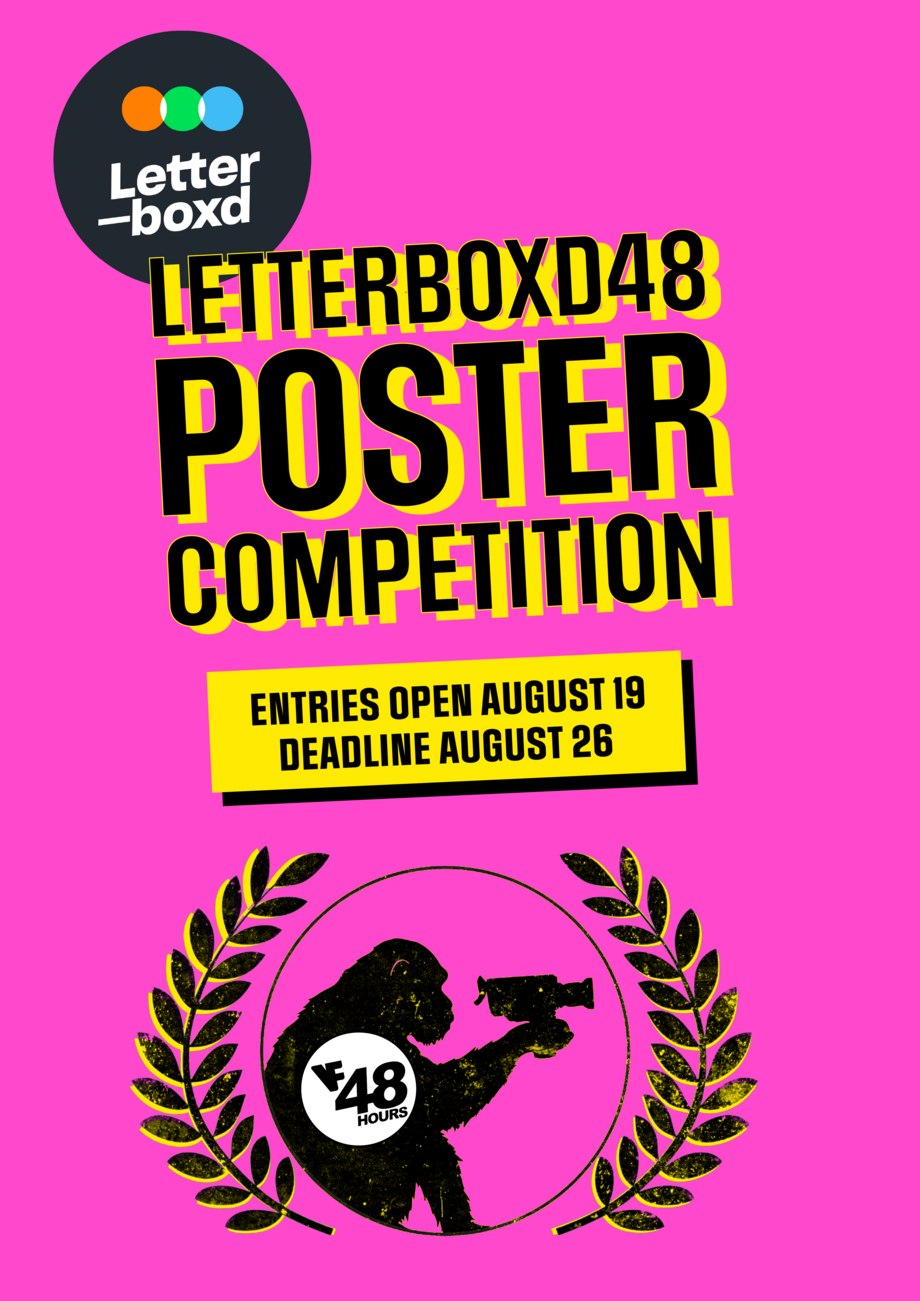
So, you've wrapped your whirlwind 48Hours filmmaking weekend! You're likely exhausted but buzzing with the energy of creation. Now, as the deadline for the Letterboxed48 Poster Competition looms (August 26th!), it's time to shift your focus to visually representing your incredible short film. Remember those brilliant production stills you captured on set? They're about to become invaluable!
Your poster is often the first glimpse audiences will have of your film. It needs to be more than just a pretty picture; it needs to encapsulate the essence of your 48Hours creation. Here are some key considerations as you embark on designing your winning poster:
- Tone is Key: What Feeling Does Your Film Evoke?
Before you even open your design software, ask yourself: What's the overall mood of our film? Is it a hilarious comedy, a chilling horror, a poignant drama, or a quirky sci-fi adventure? Your poster's visual style – from color palette and typography to imagery and composition – should immediately communicate this tone.
- Comedy: Think bright colors, playful fonts, and expressions that hint at the humor.
- Horror: Consider dark, moody colors, unsettling imagery, and perhaps a sense of unease in the layout.
- Drama: Often relies on impactful character portraits, perhaps in muted tones, conveying emotion and intensity.
- Sci-Fi/Fantasy: Can explore futuristic or fantastical elements through abstract designs, unique color schemes, and intriguing visuals.
Look at posters for films with a similar genre or tone to yours. What design choices did they make? What resonates with you and why?
- Intrigue is Your Hook: Make Them Want to Know More
A successful poster doesn't reveal everything; it sparks curiosity. It should make viewers ask questions and want to seek out your film.
- Tease, Don't Tell: Instead of a straightforward plot summary in image form, consider a symbolic visual, a captivating close-up, or an intriguing juxtaposition of elements.
- Create Mystery: Use shadows, partial reveals, or unusual perspectives to pique interest.
- Evocative Imagery: A single, powerful image can often be more effective than a cluttered collage. Think about the striking imagery of "Once Were Warriors" or the atmospheric beauty hinted at in posters for "The Piano."
- Featuring Your Stars: Showcasing Your Main Characters
While not always necessary, featuring your main characters on the poster can be a great way to draw viewers in, especially if they delivered memorable performances.
- Central Figure: A strong portrait of your protagonist can be very impactful.
- Dynamic Ensemble: If your film relies on the interaction of several key characters, consider a composition that showcases their relationships or individual personalities.
- Contextual Placement: Even if characters are featured, consider their placement and expression within the overall poster design to further communicate the film's tone.
- The Visual Hierarchy: Guiding the Eye
A well-designed poster has a clear visual hierarchy, leading the viewer's eye to the most important information first.
- Dominant Image: The central visual element should be the most prominent.
- Title Treatment: The film's title needs to be easily legible and strategically placed. Consider its size, font, and color in relation to the background.
- Key Information: Elements like the 48Hours logo, the Letterboxed48 competition mention (if required), and potentially a tagline should be present but not overwhelming. Think about the classic "Boy" poster and how the title is integrated simply yet effectively.
- Poster Layout and Composition: The Art of Arrangement
The way elements are arranged on your poster significantly impacts its overall effectiveness.
- Rule of Thirds: Dividing your poster into a grid can help create balanced and visually appealing compositions.
- Negative Space: Don't underestimate the power of empty space in highlighting key elements.
- Leading Lines: Use visual elements to guide the viewer's eye through the poster.
- Beyond the Poster: Banners and Thumbnails
Consider how your poster design might translate into other formats:
- Banners: Often wider than they are tall, banners might require a slightly different crop or arrangement of elements. Keep the core visual impact intact.
- Thumbnails: These small versions need to be easily recognizable even at a reduced size. Focus on the most crucial imagery and ensure the title remains legible. A strong, simple central image often works best for thumbnails.
Ready to Design?
Now's the time to revisit those fantastic production stills. Which images best capture the tone and intrigue of your film? Experiment with different layouts, typography, and color palettes. Don't be afraid to draw inspiration from iconic New Zealand film posters and international classics alike.
This is your chance to create a lasting visual representation of your 48Hours achievement. Good luck, and we can't wait to see your stunning entries in the Letterboxed48 Poster Competition!